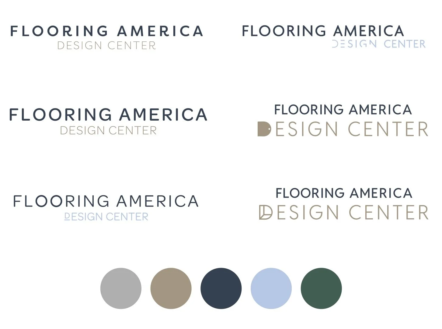
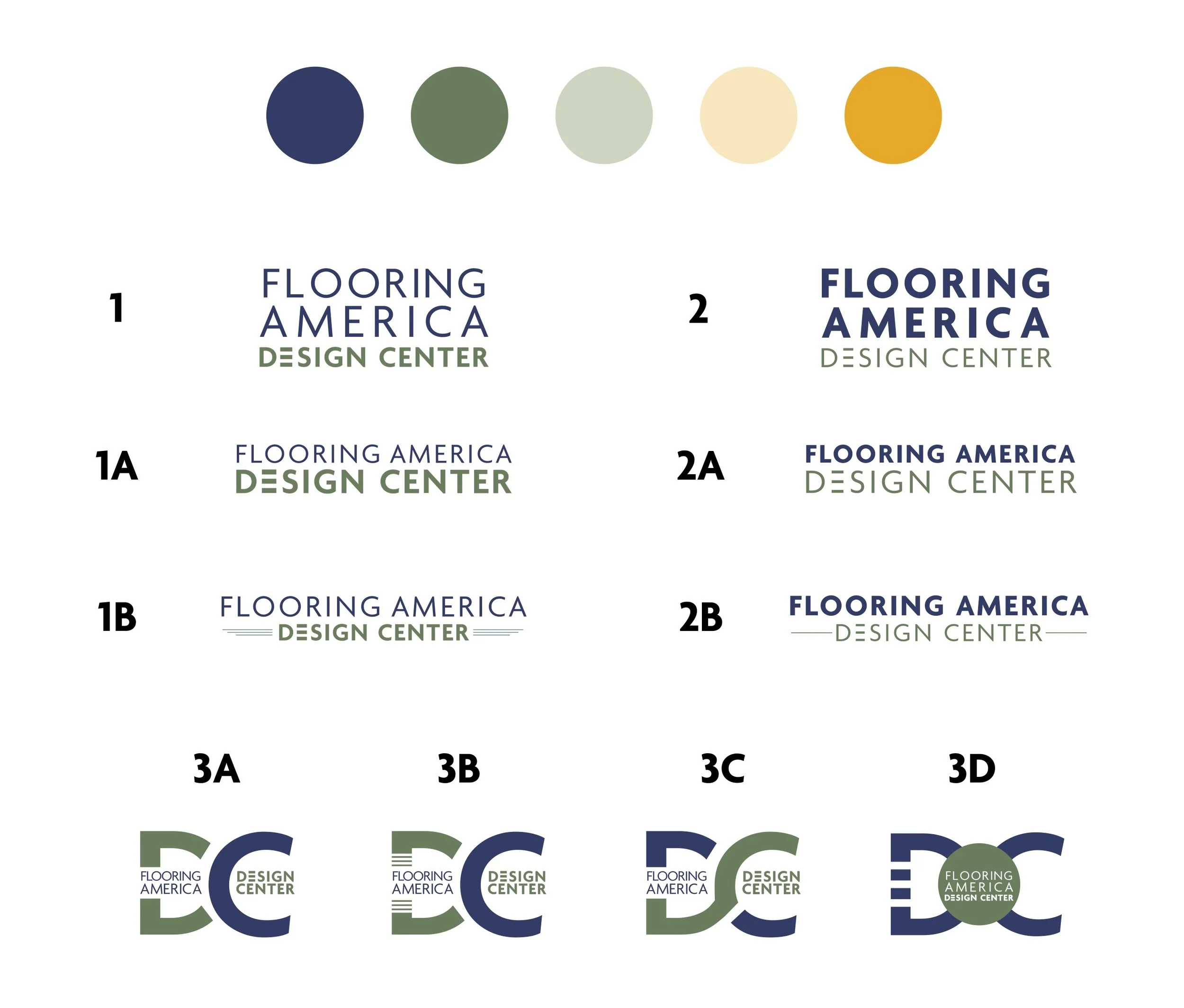
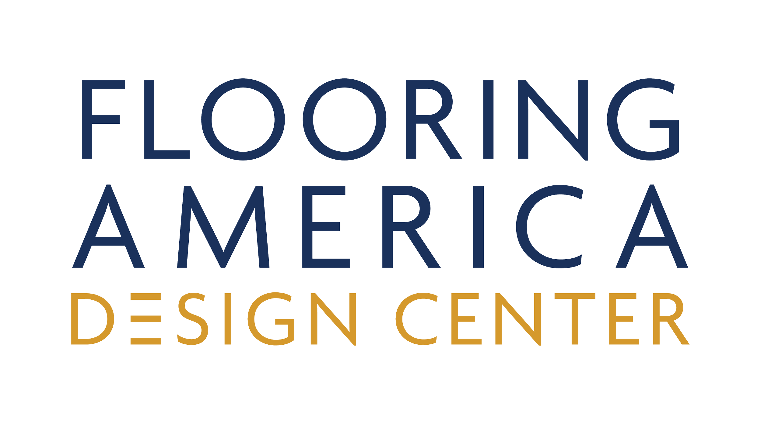
This rebrand aimed to help the client move beyond their existing identity, stand out from big-box competitors, and appeal to a younger, high-income audience. The goal was to balance premium and approachable, bridging affordability with elevated appeal. The first direction desired more minimalist with warm neutrals and cool tones (see first image), but feedback shifted the vision toward a bolder, more retail-forward look featuring the cutout three-lined “E.” I refined the visual system to enhance impact, introducing stronger colors and typography while preserving core elements.
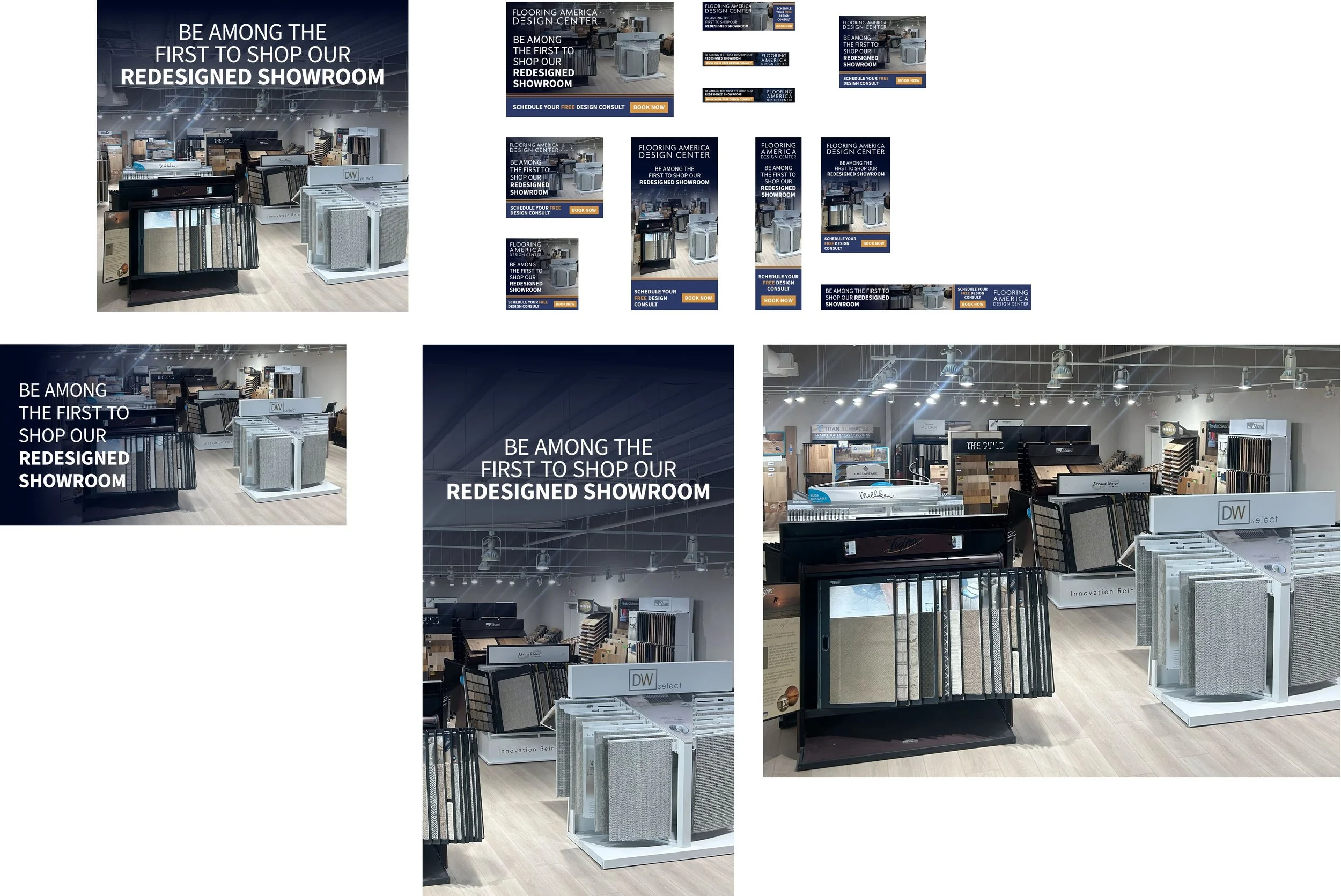
Final deliverables included a redesigned logo, comprehensive brand guidelines, and a full suite of launch collateral featured in the final images including Google display, social & web assets, a bi-fold direct mail invite and a flyer.